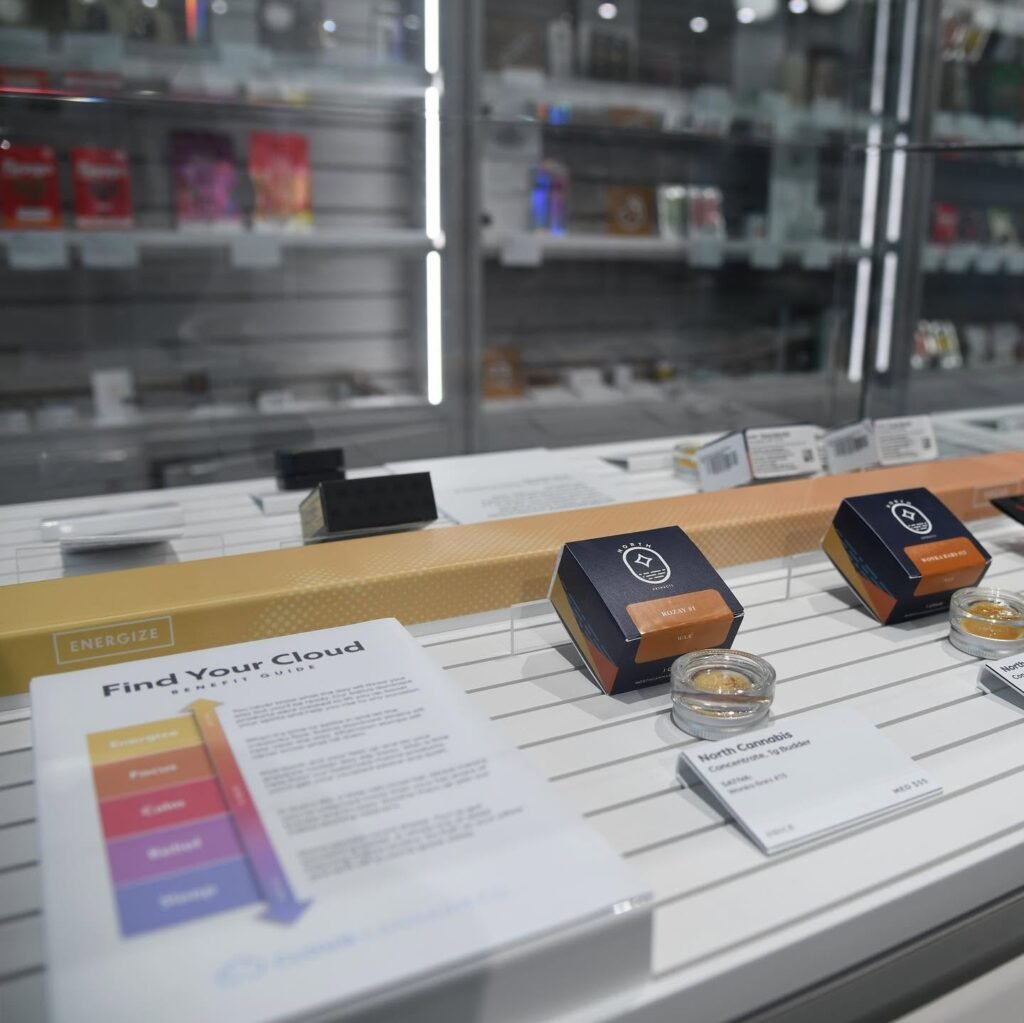
Walk into a dispensary and look around for a minute. There are plenty of products competing for attention, and most of them are trying to say something in a very small amount of space. That’s where a cannabis branding company can make a real difference. Good branding is not just about putting a nice logo on a jar and calling it done. It’s about creating an identity people can recognize, remember, and actually feel something about. Cannabis shoppers often have plenty of choices sitting right beside each other, so the package has to communicate quickly. Is the product premium? Relaxed? Modern? Natural? Fun? Trustworthy? The design, colors, typography, imagery, and even the way information is arranged all help answer those questions before anyone has opened the package. If the branding feels generic, the product can easily get ignored. Simple as that.
The Shelf Is a Competitive Place
A dispensary shelf does not give brands much time to make an impression. People scan products quickly, especially when they already have a general idea of what they want. A crowded package with too much text can get lost just as easily as packaging that looks like everything else. Strong cannabis product branding starts by understanding this reality. The goal isn’t necessarily to be the loudest product in the room. Sometimes being cleaner and easier to understand works better. A distinctive color treatment, unusual typeface, memorable symbol, or clear visual system can help a product register in someone’s mind. And once they’ve noticed it, the branding should make sense. Random design choices might look interesting on a screen but fall apart when several products are lined up together. Shelf presence is about consistency, recognition, and knowing when to stop adding stuff.
Design Should Tell People What They’re Buying
Good packaging design does some of the talking before the budtender or customer ever explains the product. If a brand sells calming products, for example, the visual identity might feel softer and more relaxed. A product built around energy or creativity may take a completely different direction. There’s no universal cannabis aesthetic, and honestly, that’s a good thing. Brands have room to develop personalities instead of copying whatever is currently popular. The important part is making sure the design supports the actual product and audience. Product names, strain information, potency details, usage information, and required warnings still need to be readable. Branding should never make essential information harder to find. A beautiful package that leaves customers confused is not doing its job.
Creating Recognition Beyond One Purchase
The real value of branding shows up after the first purchase. Someone sees a package again a few weeks later and immediately recognizes it. That little moment matters. Strong cannabis branding creates visual cues that can work across different products, sizes, and formats. Maybe it’s a certain logo treatment, a recognizable illustration style, or a particular way of using typography. Over time, those details become part of the brand itself. This is especially useful when a company expands its product range. A new edible or vape should feel like it belongs to the same family without looking like a copy of an older product. Customers shouldn’t have to squint at the label to figure out who made it. Recognition should happen naturally.
Packaging Needs to Work in the Real World
One thing that gets overlooked in branding discussions is the physical reality of packaging. A design can look fantastic in a presentation and then feel completely different when printed, folded, wrapped, or placed on a small container. Cannabis packaging has practical requirements too, including product information, warnings, labeling rules, and other compliance considerations that vary by market. Designers need to account for all of that from the beginning rather than trying to squeeze required information into an already finished concept. Materials matter as well. A package should feel appropriate in the hand and hold up during transport and storage. It’s not glamorous, but it matters. If the label peels off or the printing looks cheap, customers notice.
A Distinctive Brand Doesn’t Have to Be Loud
There’s a tendency in some industries to assume that standing out means using the brightest colors, biggest graphics, or most unusual shapes possible. Cannabis branding doesn’t have to work that way. In fact, a restrained design can sometimes be more noticeable because everything around it is shouting. Minimal packaging, strong typography, unusual textures, or a thoughtful use of empty space can give a product a very different presence. The trick is having a reason behind the choices. Minimal for the sake of minimal isn’t a strategy. Neither is making something weird just because you want people to talk about it. A strong visual identity should feel intentional, even if the final result looks simple.
Why Custom Packaging Can Strengthen the Brand
For brands trying to create a more memorable shelf presence, custom cannabis packaging gives them more room to control the customer experience. Instead of relying on an off-the-shelf container with a basic label, a brand can think about how shape, material, finishes, graphics, and opening experience work together. That doesn’t mean every company needs an expensive package with fancy extras. Sometimes a small structural detail or well-designed label can do plenty. What matters is creating something that feels connected to the brand rather than like a generic container with a logo stuck on it. Packaging is one of the few physical marketing tools customers actually hold in their hands, so there’s an opportunity there that shouldn’t be wasted.
Branding Should Continue After the Shelf
A product’s branding shouldn’t disappear once someone leaves the dispensary. The same visual identity should ideally work across websites, social media, advertisements, retail displays, email campaigns, and other customer touchpoints. When everything looks connected, the company starts to feel more established. This also makes marketing easier because there is already a visual language to work with. A recognizable product photographed for Instagram should still look like the same product sitting on a shelf. That kind of consistency builds familiarity without requiring customers to consciously think about it. People tend to remember things they see repeatedly, especially when those things have a clear identity.
The Best Branding Gives People a Reason to Remember
At the end of the day, cannabis branding is not about making a package look expensive just for the sake of appearances. It’s about making the product easier to notice, understand, and remember. A strong brand gives customers something to connect with before they even try what’s inside. It can communicate personality, quality, purpose, and difference in a matter of seconds. That’s useful in a market where plenty of products can start looking similar after a while. The brands that take their identity seriously usually have a clearer story to tell, and that story can carry from the shelf to the next purchase.
Standing Out Starts With Knowing What Makes You Different
There’s no magic color, font, or packaging shape that guarantees attention. What works for one cannabis company might completely miss the mark for another. The starting point is understanding what makes the product different and who is actually buying it. From there, the branding can build around that difference instead of borrowing someone else’s personality. That sounds obvious, but it’s surprisingly easy to lose sight of when trends move quickly. A strong cannabis brand doesn’t need to chase every new visual style. It needs an identity that makes sense, feels believable, and can stick around. When the branding does that, the shelf becomes more than a place to display the product. It becomes the first real introduction to the brand.