Your booth can look impressive and still lose valuable visitors.
A crowded entrance, confusing product placement, or poorly positioned meeting area can make visitors walk past before they even understand what your brand offers. The problem may not be your products or marketing—it could be the way your space is arranged.
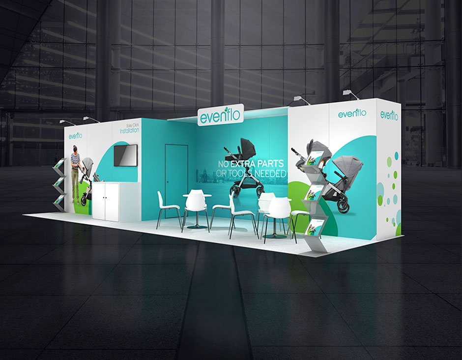
A smart 10×20 booth layout should do more than fill your floor space. It should attract attention, guide visitor movement, showcase your key products, and make conversations feel natural. If your booth is not doing these things, it may be hurting your trade show results instead of helping them.
A well-planned booth can make it easier for visitors to notice your brand, explore your products, and start conversations. But even a spacious 10×20 booth can underperform when the layout creates confusion, blocks movement, or gives visitors no clear reason to stop.
Where Your Booth May Be Losing Visitors
Many exhibitors try to use every available inch. The result can be a crowded space where products, graphics, furniture, and visitors compete for attention.
Common issues include:
- Oversized furniture near the entrance
- Too many products displayed together
- Important branding hidden behind structures
- Narrow walking paths
- No dedicated space for private conversations
The goal is not to fill the floor. It is to make the space comfortable and easy to understand.
Think About Visitor Movement
Your booth should naturally guide people from the aisle toward the areas you want them to explore. Keep the entrance open and place your strongest visual or product feature where it can be noticed quickly.
| Area | Better Approach |
|---|---|
| Entrance | Keep it open and welcoming |
| Product display | Show fewer, stronger products |
| Branding | Make the main message visible |
| Meeting area | Use compact furniture |
| Demo space | Keep demonstrations easy to see |
Give Every Section a Job
A successful 10×20 booth should have a clear purpose for every area. Product displays can attract attention, while a smaller meeting zone can support serious conversations.
Keep Your Message Clear
Visitors should understand what you offer within seconds. Use short headlines, strong visuals, and simple benefit-focused messaging instead of covering walls with text.
Avoid Overcrowding
More furniture does not necessarily create more opportunities. Choose seating and counters that support conversations without restricting movement.
Check the Layout Before the Show
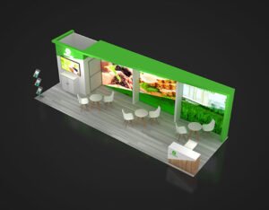
Before approving the final design, walk through the space from a visitor’s perspective.
Ask:
- Can visitors enter easily?
- Can they move around comfortably?
- Is the main message immediately visible?
- Are key products easy to find?
- Does the meeting area feel comfortable?
The best 10×20 booth is not the one with the most elements. It is the one where every element has a clear purpose and helps visitors move naturally from curiosity to conversation.